Are you tired of hearing about the marathon yet? Well after Twin Cities I am pretty much pain free by now!!! YAY!! Thanks for all the congratulations, comments, and insights about my race. They are appreciated. Below are a few charts I’ve pulled out from SportTracks. They give a nice visual reference for the 26.2 mile journey called a marathon. In case you missed the more detailed race reviews, look back at Grading the Race Plan and Race Review.
You can get a better glimpse of the images by clicking on them.
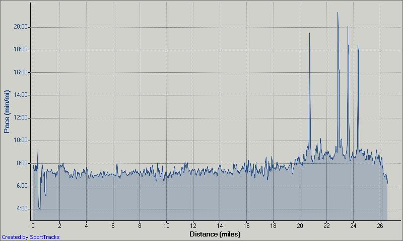
First up is the pace chart, you can clearly see the 4 walk breaks and I would say some early inaccuracies (pace dips at beginning). There is no way I ever ran at 4 minute pace, even for a split second!
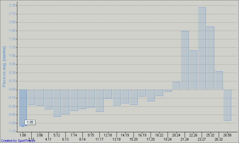
This next chart shows my pace per mile. For some reason SportTracks really thinks I ran a 6:40 mile, but I showed you yesterday that it was more like 7:27. I should also note that the miles it shows at the bottom (1.08, 2.11, etc) that is based on the splits I took after passing each mile marker.
This is the first time I’ve ever viewed this chart before. It shows the pace per mile in comparison to the overall average pace. My average pace was 7:51.
In the past the elevation chart has tended to be the most inaccurate part of the Garmin data. You can look at the marathon’s official elevation chart here (PDF)
Is this too much data? I’m really intrigued by the discrepancies within the data. I’ve never noticed it before. What do you think?
Related articles by Zemanta
[tags] Twin Cities, Marathon, Twin Cities Marathon, Garmin, GPS[/tags]


![Reblog this post [with Zemanta]](https://i0.wp.com/img.zemanta.com/reblog_e.png?w=625)